Natural Expressions In the Workplace
Our Natural Expressions wide plank flooring line was created with the intent of bringing a greater biophilic color wheel into contemporary designs. Through a thoughtful collaboration with interior designer David Senise, we have developed a collection of 12 hues and tones inspired by nature’s palette that bring both sophistication and grounded aesthetics into commercial and residential spaces.
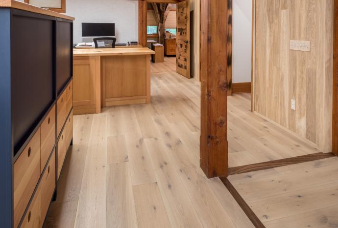
When developing this product line for market, our sister company, New Energy Works was beginning the process of upgrading their design and build studio space in our Farmington, NY office space and took an interest in this new line.
“We wanted to use something from our sister company Pioneer Millworks in our studio remodel,” says Bethany Schaertl designer for New Energy Works. “When the new line came out, we thought that this would be an awesome way to display it in addition to Pioneer Millworks having a showroom for the line.
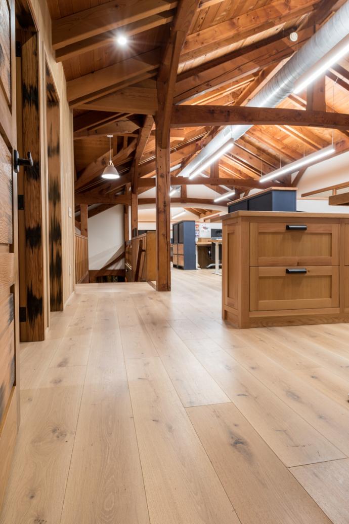
The New Energy Works design studio provided the perfect template to see how the Natural Expressions line performed in a high traffic commercial location. Additionally, it presented Schaertl and the design team the chance to work with the product line’s 12 colors and how they could play with the hues of the timber framed office.
Schaertl continues, “We have other more rustic looking and reclaimed flooring materials throughout the office, and they work well, but Natural Expressions is really convenient for our space because it offers a more clean and contemporary aesthetic and wide withs with lots of durability.”
Made with our sustainably harvested FSC® Certified Casual White Oak, the Natural Expressions Collection utilizes an 8” wide plank format and an all-natural UV Cured Hard-Wax oil finish, giving any space an organic flow by allowing each board to express a variety of wood grain patterns and specialized tones, as well as a dependable durability for both commercial and residential purposes.
For architects, both the species and the color choices of Natural Expressions work together to elicit an appropriate personality based on its prospective usage. Schaertl says, “I think it’s a nice material. From a design perspective the casual white oak is beautiful and adds elegance in spaces. It’s also really calm and easy going for more casual or private spaces. It’s got the knots, it’s got the character, it also has this smooth sophisticated finish with a beautiful sheen to it. It’s high quality and more cost effective compared to other materials.”
The ability to compliment a design idea with a color pulled from and influenced by nature opens up a plethora of possibilities. With a wide range of tones and shades available, monochromatic design can be pushed aside for a diverse and flexible design intent.
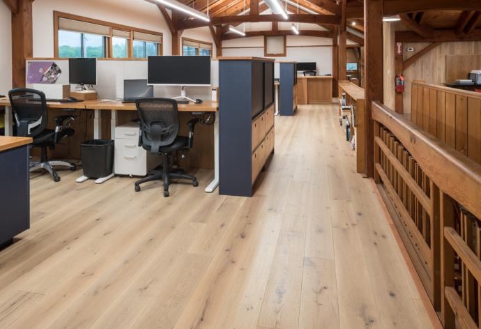
Schaertl continues, “When I’m trying to select a finish to work with from the Natural Expressions line, I’m usually looking at the big picture items. Whether it’s the timber frame, the kitchen cabinetry, the wall paneling, the tongue and groove [ceiling], or the overall concept and color scheme. We are always working with different materials, so I try to make them work together harmoniously. A lot of times, it’s with the orange undertones of a Douglas fir timber frame. We are going to try to find those undertones in the stains and the finishes on the timber to coordinate with the flooring or whatever the case may be. For our studio we liked the “Ginger Root” finish as it mimicked some of the pink and orange hues in the Douglas fir, but in a more muted, elegant way.”
In a large-scale commercial space like the New Energy Works design studio, or alternatively, an intimate and personal home, the Natural Expressions line’s ability to assimilate seamlessly into its environment both aesthetically and physically make it an exciting choice for designers and builders alike.
“Many of the Natural Expressions finishes are similar if you look at them graphically on a computer screen, it can be difficult to tell the difference. But when you look at them in person and over a big expanse, you start to really see all of the specific details and differences. It’s already proven to be a great option to share with our design clients. They’ve been really positive about it.”