2025 Seasonal Color Choices – A Contemporary Vibe, Countrified
Picking an exterior siding color is a decision that requires careful thought and consideration. The choice gives your home personality and curb appeal, and when you choose wood cladding with high-quality pigments your color choice will last a long time.
But how do you choose? New Energy Works architect Kyle Barber advises, “Siding can be a hard choice for homeowners because the choice will be there for a long time. Unlike painting a wall, re-doing your house color is a lot of work.”
He continues, “the trick to choosing siding colors are the other materials you’re using—look at the base color of those things. Then you can choose a complimentary color for a contrast. If you have a blue-based stone, for example, choose a siding color with an orange undertone. If you’re looking for a more homogenous style that blends into a lakeside surrounding, stick within the warm vs cool family. With your blue stone you could choose a siding color that has a green or blue base.”
Our 2025 Exterior Seasonal Colors streamline decision making with a palette that elevates designs yet assimilating into its surroundings. This new collection features relevant and lyrical hues that sing harmoniously with your design intent. Think of it as color karaoke.
“We're always listening to client feedback and watching evolving color trends to guide the development of new finishes,” Jered Slusser, Pioneer Millworks Sales Manager shares. “For Summer 2025, we wanted to introduce a fresh palette of colors that celebrate both regional charm and natural beauty.”
Taking these factors into consideration, The Pioneer Millworks seasonal pallet is designed for architects and homeowners looking to a specific location, time, and intent. Reds that pull from the Adirondacks of the Northeast, deep greens that blend into the Mountain forests, neutrals for the sun-baked seaside of the Gold Coast, and intentional blues for the lore and warm welcomes of the Southeast.
Barber says, “We’re seeing the exteriors trends pull-away from the high-contrast that has been favored over the last few years. Fewer stark black windows with white siding. More observation to the natural materials that surround the home so that it feels like it belongs.”
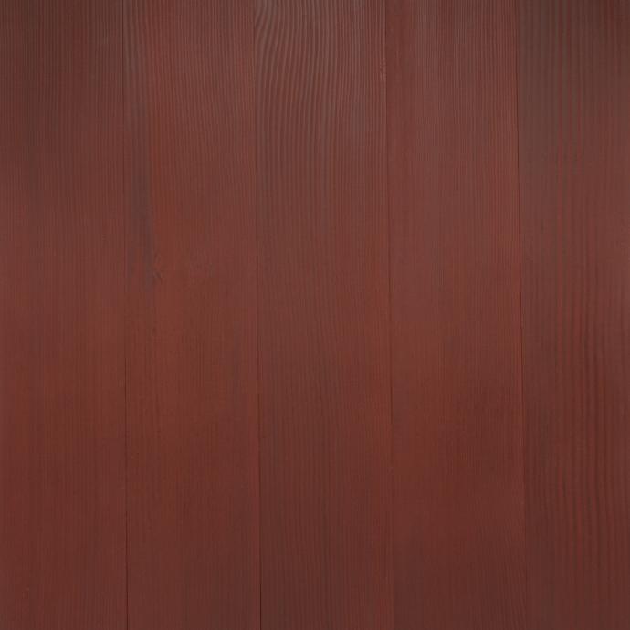
Developed in our West Coast Color Lab by our color specialist Megan Samuels, Slusser shares the intent. “Mountain Laurel draws from the deep, rich tones of green highland conifers, while Poppy offers a warm contrast. You’ll find this pairing a lot in the great camps of the Catskills and Adirondacks.”
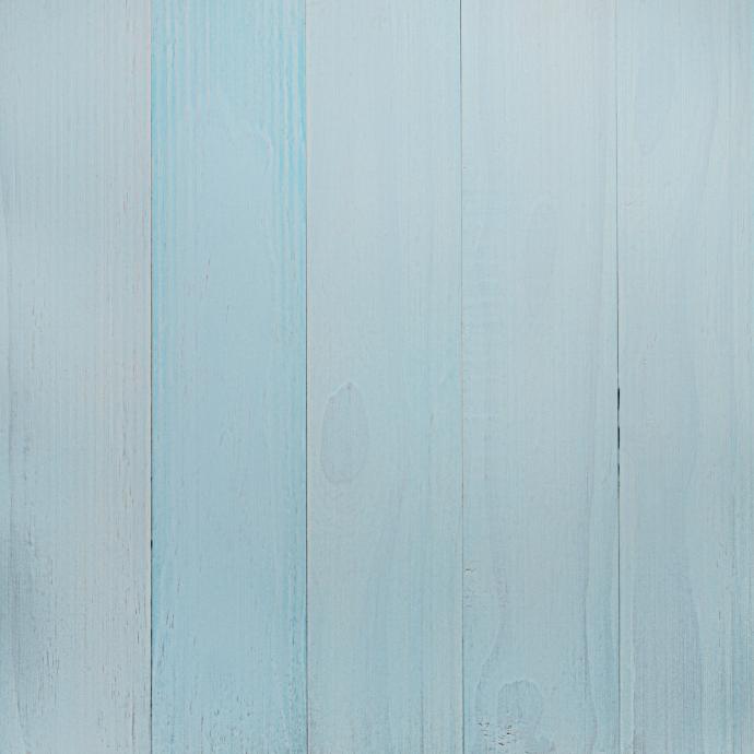
He continues, “Lowcountry Blue is our nod to timeless Southern elegance of a welcoming front porch, while Twilight Blue delivers a dramatic, moody hue perfect for making a statement. Finally, Pearl brings a soft blend of neutral whites and grays that highlight the wood’s natural grain with a laid-back sophistication.”
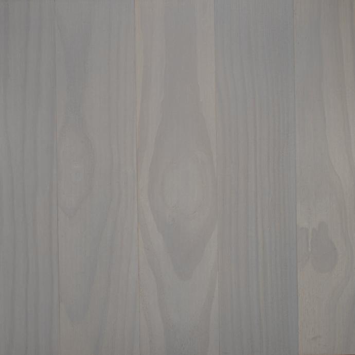
Revealing a new combination of high-quality and long-lasting colorful and sustainably sourced wood siding options gives our team such joy. “There are a lot of options in the market for siding, but few evolve their pallets yearly to respond to customer feedback and design trends,” Slusser explained. “Yes, choosing an exterior siding color is a long-term commitment but that doesn’t mean you should be stuck with the same ole’ brown, black, and sand tones when you’re going for a stained wood siding. Designs evolve and we want our customers to be able to choose from a selection of thoughtful and relevant options. It’s why we’re always evolving what others consider static.”
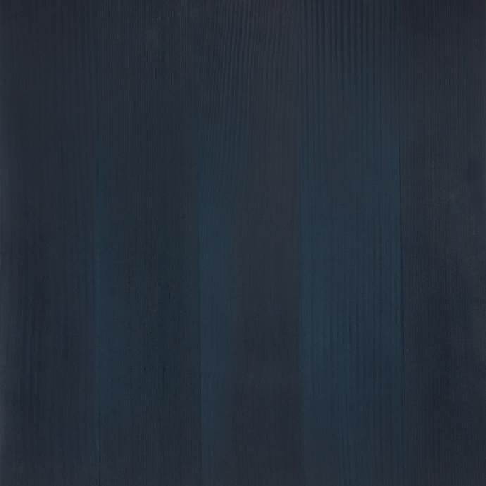
By covering a spectrum of classic and current, the real magic occurs when our siding is used in conjunction with its surroundings, making your project a seamless or divergent partner with its environmental context.
