Classically Modern
We’ve responded to changing trends and listened to our partners and clients to create a collection of exterior colors that fit exactly what is in desired in contemporary design. Pioneer Millworks seasonal 2025 pallet was designed for you, by you.
We developed this proprietary color array for architects, builders, and homeowners who require a specialized feel and specific intent. Culled from our collection of five 2025 colors this blog edition falls on two of our specialized hues.
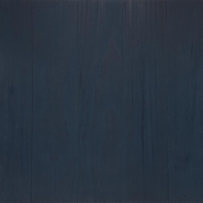
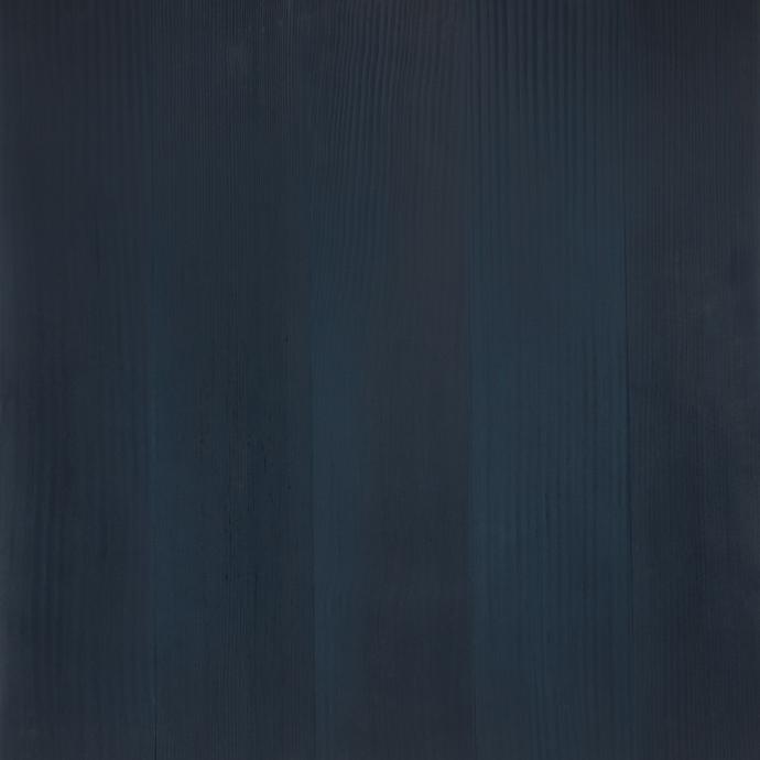
Twilight Blue: An evocative tone inspired by the gloaming, the time of day where the sky enters its slumber, sunlight fades, and the blue hour begins.
Pearl: A captivating array of creamy overtones comprised of ivory, rose, and silvery iridescence blended into a beautiful representation of nature’s most mysterious gemstone.
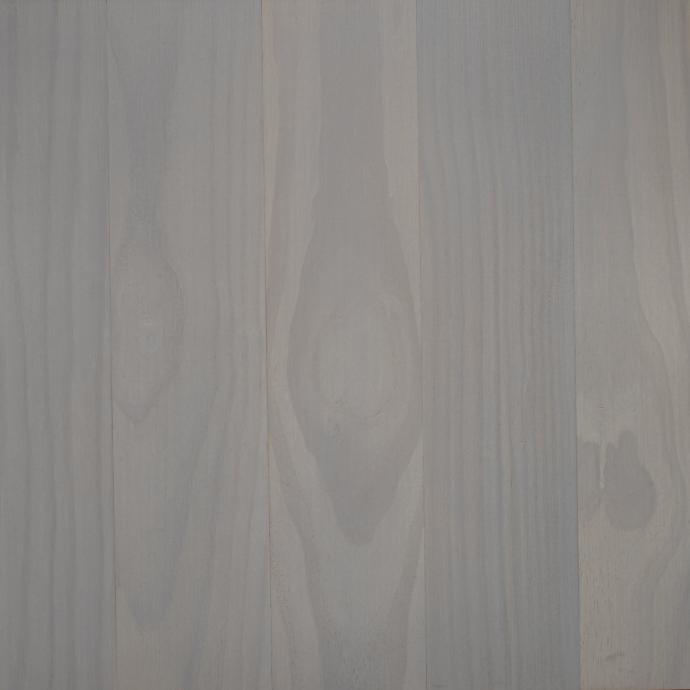
Blues and whites can easily work together, they can effortlessly pair with other hues, or they can be incorporated individually, all with equal success. Used together, these colors elicit a timeless feel whether blue is the primary color accented by white trim, or vice versa. Blue and white are a versatile duo that can sing with almost any architectural feel.
When including our seasonal “Twilight Blue” or “Pearl White” into a design, providing a balance is key. By incorporating balance, you can ensure a harmonious relationship within the primary colors as well as any accents you include.
Balance can be achieved by recognizing how these colors will interact together as well as with your surroundings, such as the landscaping, roof color, and even widow frames, as all will have an effect on the emotional effect and curb appeal of your home.
Our “Pearl,” offers a classic and clean white tone but features polished undertones that allow it to pair effortlessly with several colors. Our proprietary “Twilight Blue,” elicits a dramatic and enduring feel that can be reminiscent of both historic and contemporary designs. Paired together you are ensured a no-nonsense aesthetic that has been used historically on the most beautiful homes.
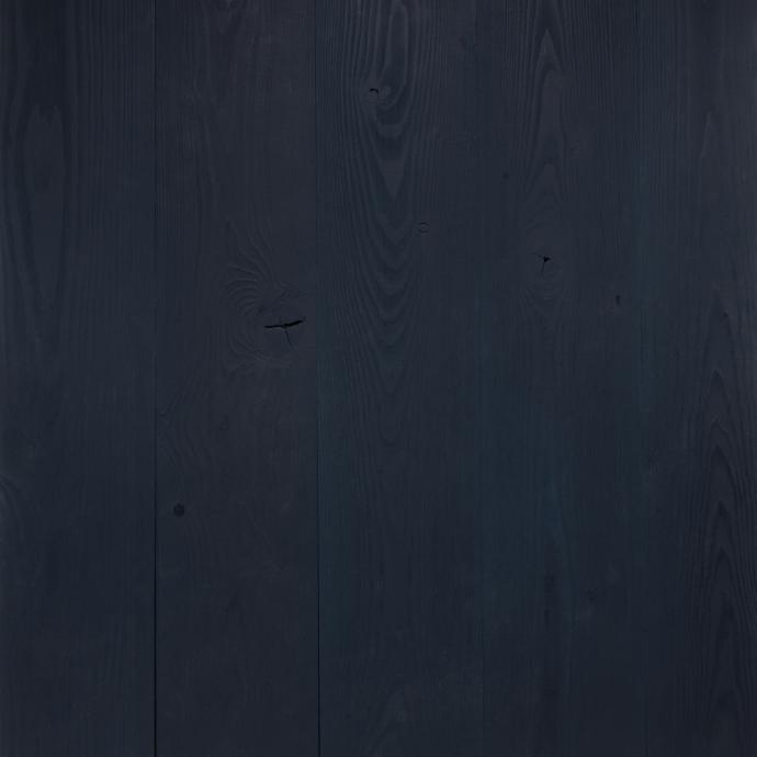
If you desire more flash to your aesthetic, adding bolder colors like yellow or green can offer specialized accents to both “Twilight Blue,” and “Pearl.” The inclusion of pastels can lend a calming softness to both, and the assimilation of golds, silvers, or brass, can increase the extravagance of any color scheme. Try pairing with gray, beige, or black, and add extra class and muted sophistication to your intent.
Finally, don’t be afraid to experiment with proportions and textures. Even minor additions and changes can take a design intent from basic to next level.
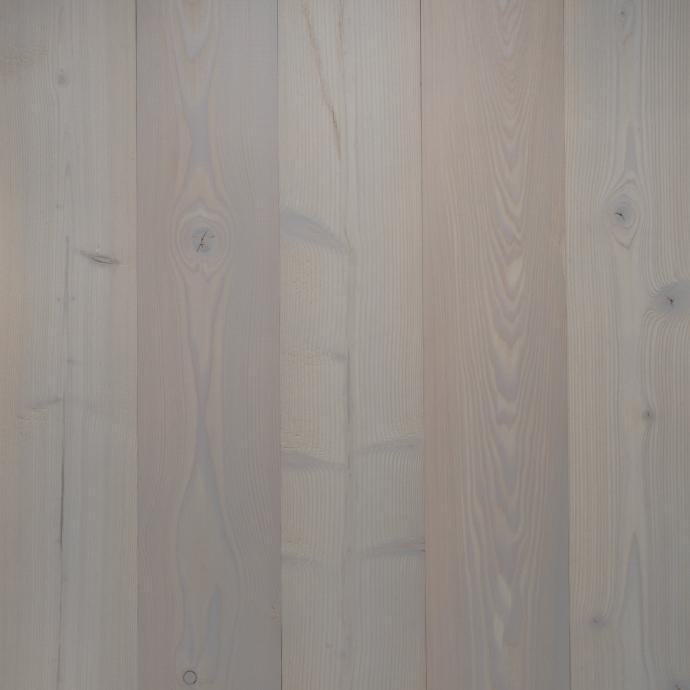
These two colors beautifully accentuate three of our responsibility harvested species. Available on sustainably sourced PEFC Larch, FSC® chain-of-custody certified Douglas Fir, and FSC cradle-to-cradle certified Accoya®, both of these color options are available on mediums that are excellent choices for material health.
While our colors have been developed for exterior curb appeal, they are diverse enough to be used for interior accent walls or any place you are looking for additional flow or colorful focus.
By offering exciting plays on a classic pallet, our “Twilight Blue” and “Pearl,” are both static and flexible. It’s all about what kind of mood you are trying to express as the possibilities are absolutely endless.
